Isomer Studio
@elastic/isomer-studio is a learning and testing shell for any Isomer pack. Run it in a pack's package directory, and it shows:
- a Home page with search, featured primitives, the pack's apps, and what the runtime loaded;
- a gallery of every primitive, grouped as the pack's authoring groups are, whose React previews mount as they near the viewport;
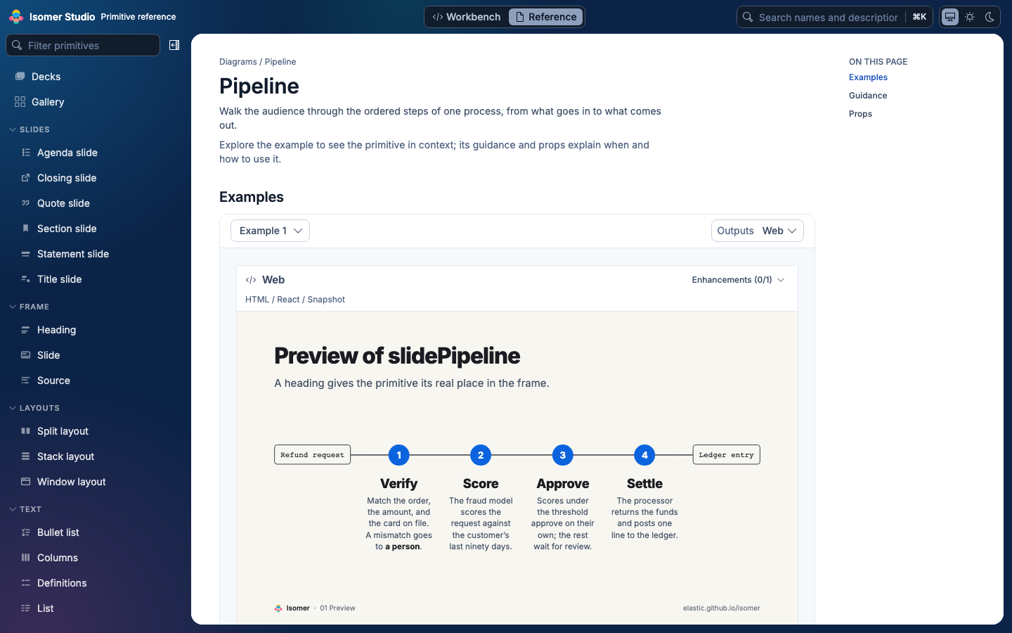
- a Reference page per primitive, with its purpose, guidance, props and live examples to teach its use;
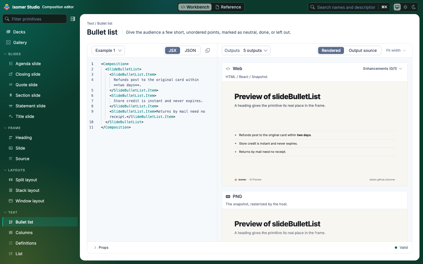
- a Workbench for editing a composition and seeing its live preview;
- a composition editor that loads and shares a whole composition by URL, like the TypeScript Playground;
- the same composition on every surface the runtime has: React, HTML, Snapshot, PNG, Slack, Markdown and text.
It ships as a command-line tool, not a React library. EUI, Emotion and Monaco are bundled into it, so a pack never takes them as dependencies.
npx @elastic/isomer-studio init
npx @elastic/isomer-studio
npx @elastic/isomer-studio build --out dist/studio --base /studio/
npx @elastic/isomer-studio check --report studio-report.json
- a config for the packs the package exports
- a local server with hot updates
- a static site
- a headless CI gate
Each command reads isomer-studio.config.ts (or .tsx or .js) from the current directory unless --config names another file, and without one says to run init; see init. Nothing needs installing first: the Studio uses the pack's React, SDK and zod, and brings the runtime. To pin the version and type-check a config, install @elastic/isomer-studio and @elastic/isomer-runtime as dev dependencies and run npx isomer-studio. In this repository, pnpm studio:dev runs the Studio from source against the root config.
To try what has merged to main since the last release, run npx @elastic/isomer-studio@next, with any command and flags after it. next is a snapshot of every Isomer package, published on each push to main that changes one, as a prerelease (0.4.1-main.<time>.g<sha>) that latest and ^0.4.0 installs never select. The Studio still loads the SDK, and the runtime when the pack has one, from the pack, so a pack on a released SDK keeps it; install the SDK and runtime at @next as well to try their unreleased changes.
In the interface, Reference teaches how and when to use each primitive, while Workbench is where you edit compositions.
init writes one like this, registering each pack the package's entry exports:
// isomer-studio.config.ts
import { createIsomerRuntime } from '@elastic/isomer-runtime';
import { defineStudioConfig } from '@elastic/isomer-studio';

import { myPack } from './src/index';

export default defineStudioConfig({
  title: 'my-pack',
  runtime: createIsomerRuntime({ packs: [myPack] }),
});
That is enough for a pack whose primitives render inside a plain view. A pack with a frame that needs a particular root, or with styling the React surface must load, adds previewExample and stylesheet; see The config.
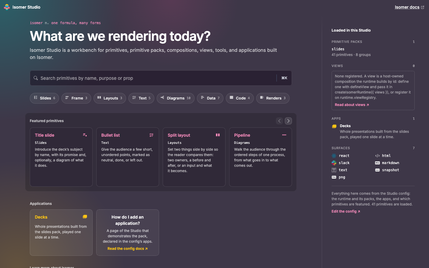
Home is a landing page for the configured developer workbench, not the introductory Isomer site. Its entry points and loaded-runtime panel reflect the packs and applications supplied by the host. The surface chart keeps its explanatory copy separate at every width, and reflows into a composition row above the surface cards when its column is narrow. Connecting lines follow the cards across wrapped rows.
Studio is primarily a desktop learning and demo tool. When Home's main column is narrower than 620px, its application, learning, and featured tiles stack vertically. Featured primitives show three tiles per page, with Previous and Next buttons; the final gallery tile occupies a paging slot. Wider columns retain the horizontal strip. This is a readable narrow-window fallback, not a mobile Workbench.
Home's Reference and Workbench actions keep the exact blue and teal from the Isomer logo. Featured and learning cards use deeper, opaque plum surfaces so their small action text stays readable without washing out the brand colors.
Home exposes its primary column as the main landmark, with level-two headings for Featured primitives, Applications, and Learn more about Isomer. The loaded-runtime panel remains a separate complementary landmark.
Links and buttons within Home use a white keyboard-focus outline that stays visible on the fixed dark palette, independently of the Workbench and Reference color mode.
Home respects reduced-motion preferences: the surface chart keeps its focus and color feedback without scaling or lifting cards, and horizontal featured paging moves immediately instead of scrolling smoothly.
- Home. An empty or unknown hash,
#/home, and the mark in the header open Home. It has the primitive search, one chip per authoring group that opens the gallery at that group, the featured primitives (the config'sfeatured, or six drawn at random) with Reference and Workbench links, a tile per app, three doors into the gallery, the Workbench and the Isomer documentation site, a chart of the surfaces the runtime has, and a panel of the packs, views, apps and surfaces loaded. With no apps or no views, the panel and the Applications row say how to add them and link to the Isomer documentation. Home keeps its own dark look; the color mode applies from Reference and Workbench on. - Navigation. With one pack, the sidebar lists primitives under that pack's authoring groups, in the pack's group order and alphabetically within each group. With more than one pack, each pack is a heading and its groups follow. Primitives no group claims are listed last, under Uncategorized. Each group collapses, the browser remembers which are closed, and a filter opens every group it matches. Resting the pointer on a name shows its first example and purpose.
- Surfaces. The Workbench preview starts with every output selected, in one column at every width. The Outputs menu checks the outputs to compare: with every output selected, choosing one shows it at full size, and choosing another adds it. Rendered or Output source applies to every card at once. The Reference example card starts on the first surface, with the example picker on the left and the same menu on the right. Its view selector switches among Rendered, Output source, and Example source; the latter shows the example as JSX or JSON.
- Zoom. With one surface picked, the preview's zoom menu scales the React, HTML, Snapshot and PNG previews: Fit width shrinks a preview to the panel's width and never enlarges it, and fixed levels run from 50% to 200%.
- Preview background. Visual previews sit on a dotted grid with a subtle shadow around the render in both color modes, making render boundaries and transparent areas visible. The grid and shadow stay at a fixed size as the render zooms.
- Color mode. The header offers Light, Dark, and System. System follows the operating system, including when it changes. The choice is remembered per browser, and previews render in the resolved mode. The Workbench keeps the editor's subdued background and uses a deeper output-pane background and plain dotted preview canvases to distinguish the working areas in both modes.
Composition, above Gallery in the sidebar, opens #/compose: the Workbench for one whole composition rather than one primitive's example. Write it as JSX, with the composition's title, subtitle, theme and meta as props of <Composition>, or as JSON, which the editor checks against the runtime's composition schema. Its toolbar copies the source, copies a link, downloads it as composition.tsx or composition.json, and starts a new composition from a starter or any primitive's example. The per-primitive Workbench's Open in the composition editor carries its draft across.
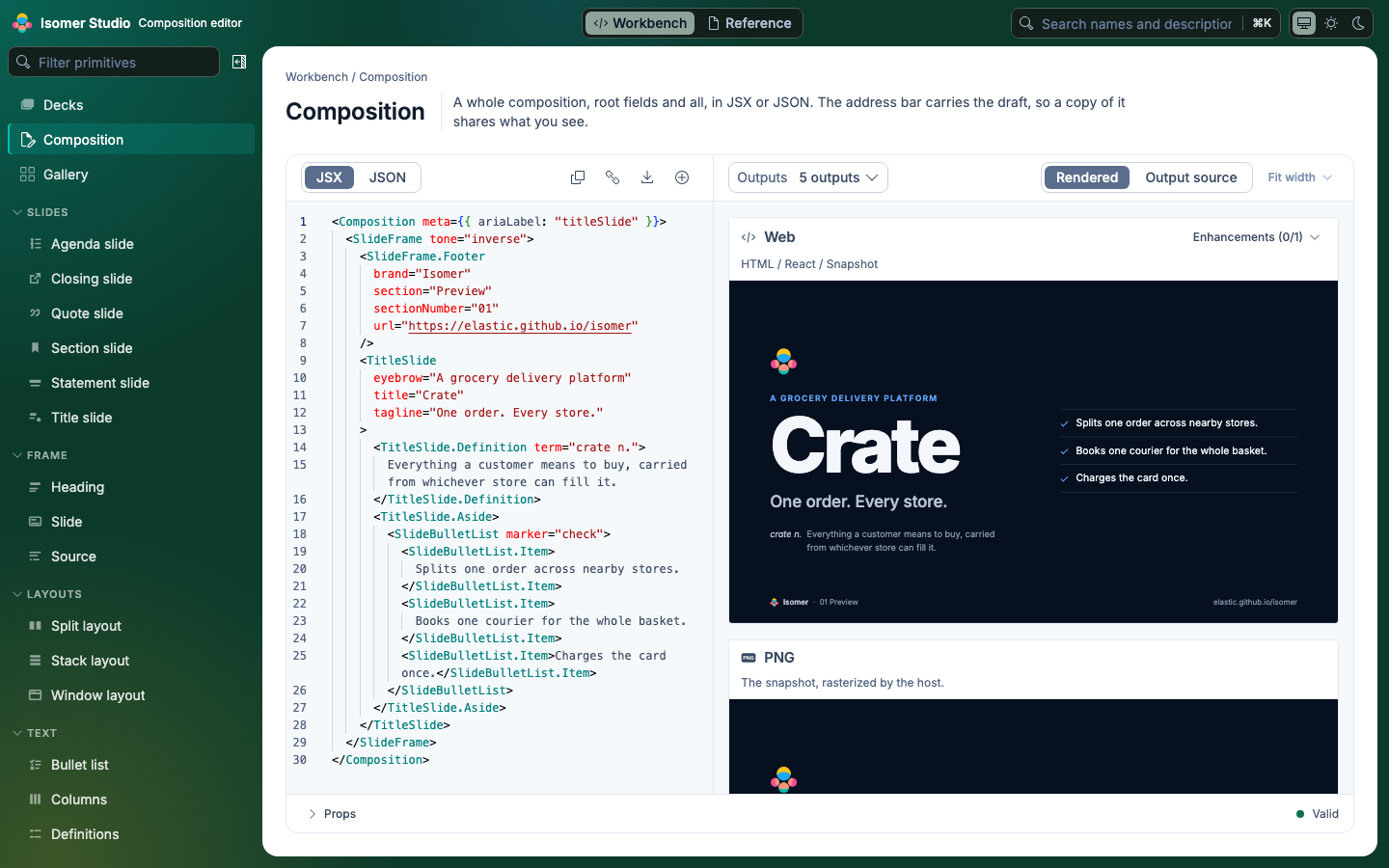
The address bar carries the draft, so copying it shares what you see, and a reload keeps it. A bare #/compose reopens the last draft in this browser. The query takes:
| Parameter | Loads |
|---|---|
code |
Source the editor compressed into the link. Copy a link writes one. |
src |
Source fetched from an https: URL, or one on the Studio's origin, without credentials and up to 1 MB. The server must allow cross-origin requests. Prefer it to a link longer than about 8,000 characters. |
lang |
jsx or json. Without it, src's extension decides (.tsx and .jsx are JSX), else whether the source opens with { or [. |
example |
<type>/<index>, one of the pack's examples, composed through the config's compose or previewExample. |
A draft over 1 MB is too large for any link, src included, since a fetched source has the same cap. The address stays at #/compose, which reopens it from this browser once it is saved there; if the browser cannot store it, a warning says a reload would lose it. To share one, download it, or split it into smaller compositions.
JSON from a link is only data, so it renders at once. JSX from a link is code that runs in the page, and under dev it can reach the Studio's server, so the preview waits behind Run this code until you have read it. JSX this browser tab wrote or ran runs without asking.
- Node 22.13 or later.
reactandreact-dom18.2 or later, below 19, in the pack, because EUI's peer range stops there.@elastic/isomer-sdkandzod, which the pack already has.@elastic/isomer-runtimecomes with the Studio when the pack does not have it.
The config, the pack and React load from the pack's own node_modules. The Studio stops when the pack's React is not 18, or when the config and @elastic/isomer-runtime see different copies of it.
This repository's reference pack has a config at packages/isomer-primitives-slides/isomer-studio.config.ts. Its Studio is deployed with these docs at elastic.github.io/isomer/studio-app/, PNGs included.
The root isomer-studio.config.ts gathers every in-repo pack with images: false. pnpm studio:dev runs it, and each PR's CI uploads a build of it; see Review a pull request.
These docs build in two places, and the app only in one:
- GitHub Pages hosts the docs at
/isomer/studio/and the app beside them at/isomer/studio-app/, so neither overwrites the other. - Codex previews of a docs change carry the docs only. Links to the app point at its Pages URL, and a PR's app preview is the CI artifact.
- PNGs of edited compositions. A static site has PNGs for the examples it prerendered and nothing else; an edited composition shows "PNG previews of edited compositions need
isomer-studio dev". See Static sites. - PDFs on a static site. Only
devwrites PDFs, so an app'srenderPdfisundefinedin a static build. - Slack
tagelements.slack-blocks-to-jsxcannot draw rich-texttagelements, so toned values render blank in the Slack preview. The Block Kit is valid, socheckpasses it. - Web fonts in the app. The app loads no web fonts, so EUI's Inter falls back to the system font.